Design Brief
Create a subscription box service with an unforgettable unboxing experience. Develop a product and a visual language that best suits your target demographic.
Logo Development
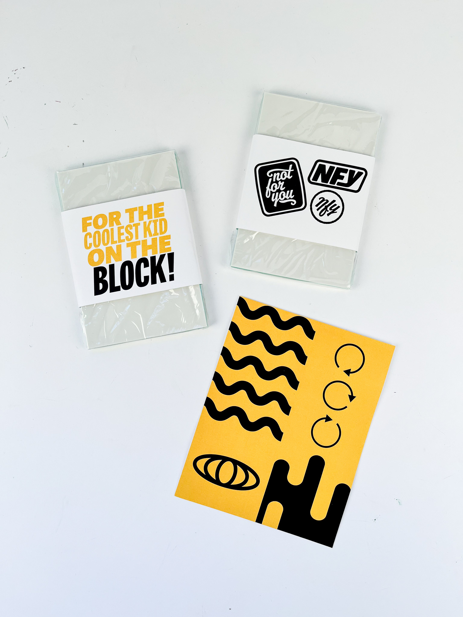
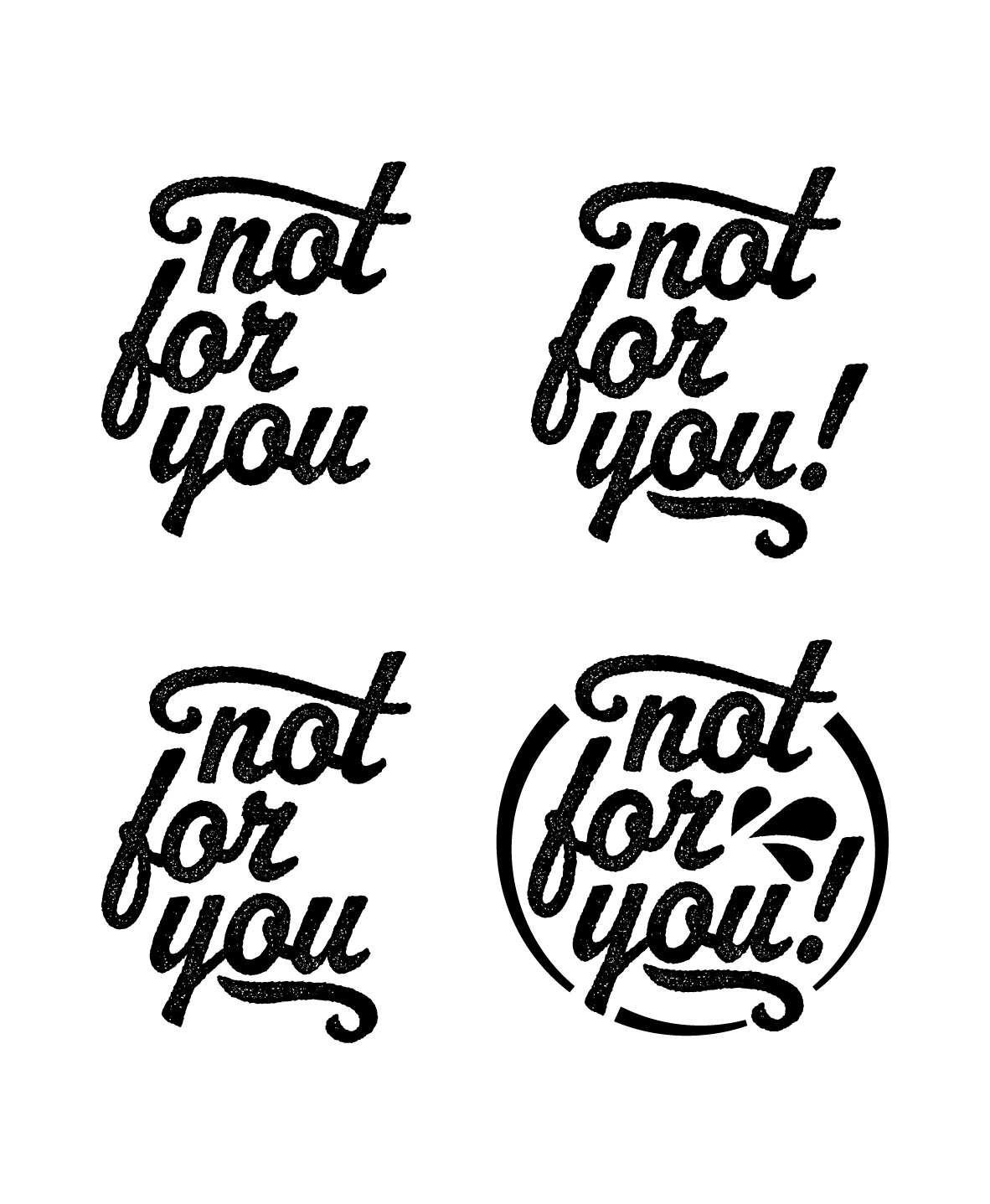
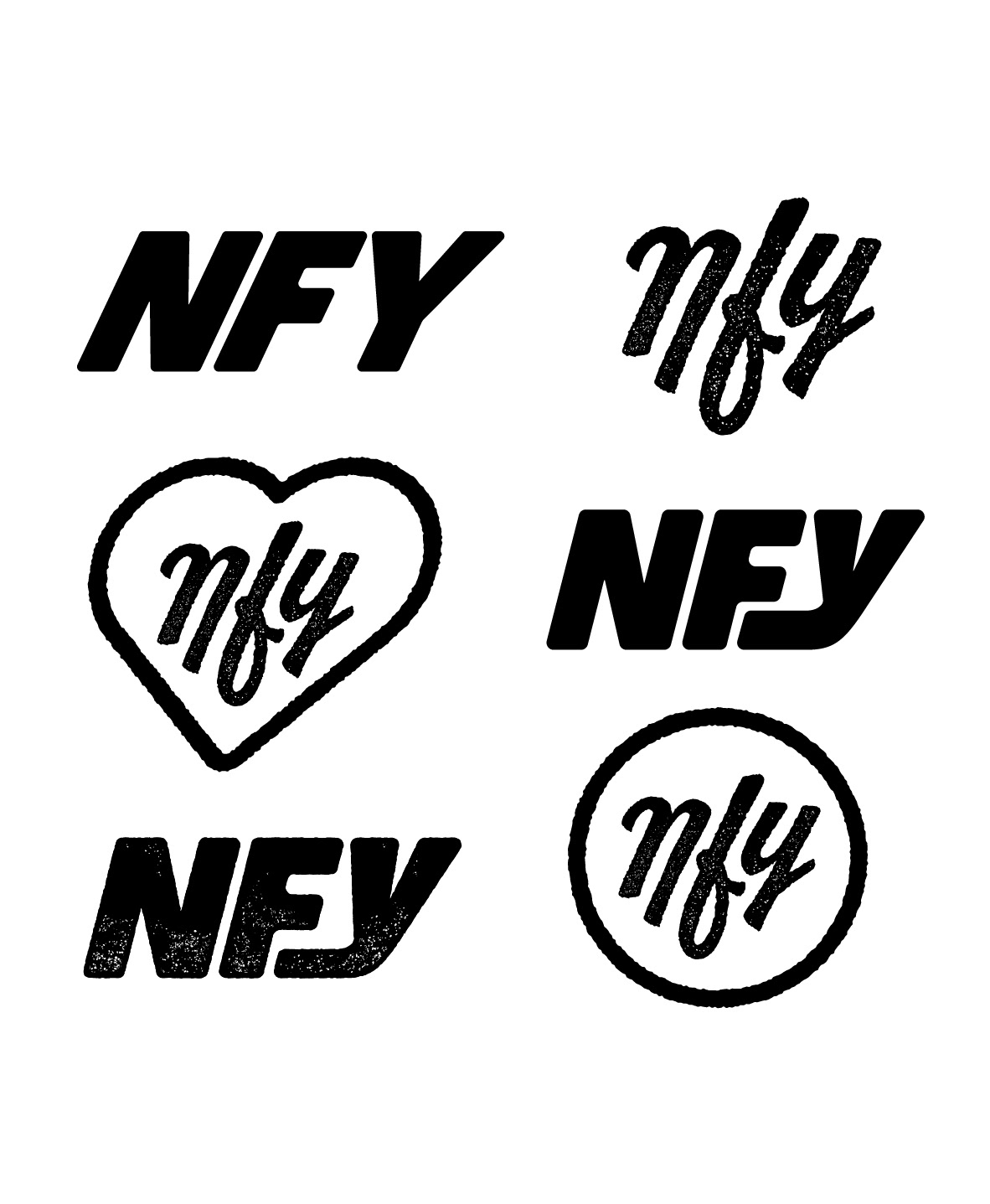
I named my brand "Not For You" because the contents of the package are meant to to be sent to others. Also, having a cheeky name works will with my target demographic. I created a main logo that had a handcrafted feel to represent that brand's goal of connecting in the real world. I also made secondary logos for use on a variety of applications.
Visual Language
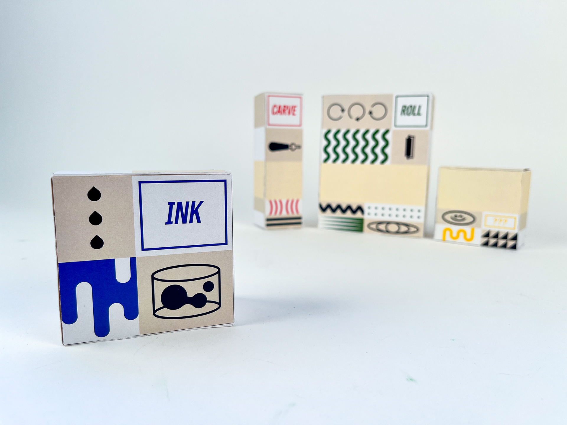
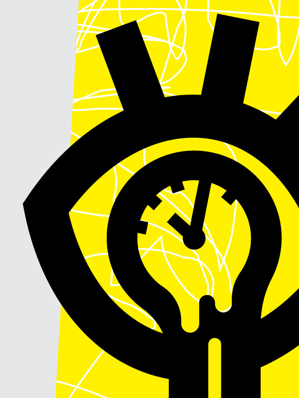
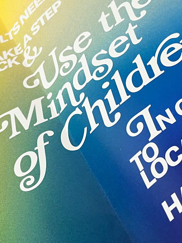
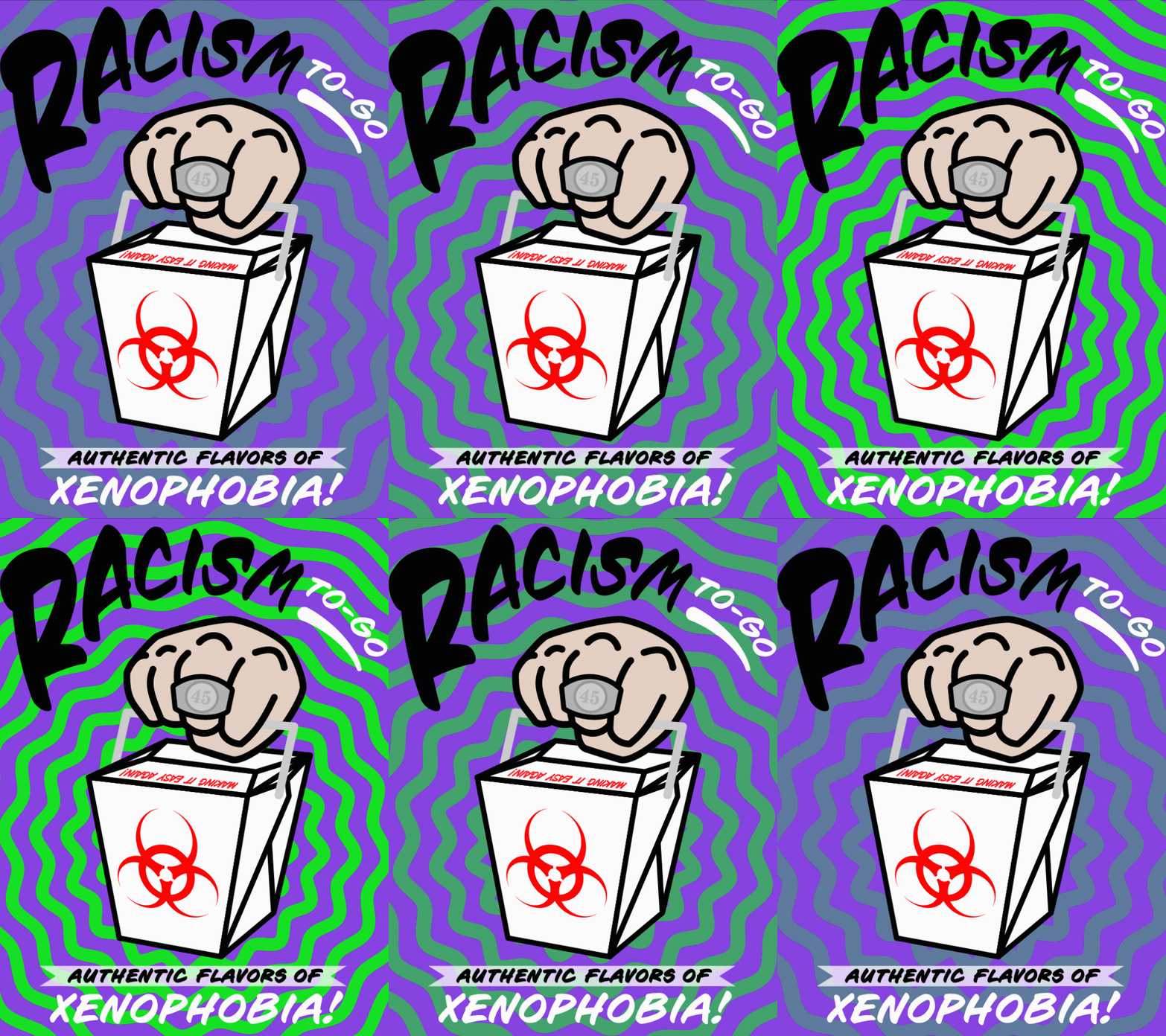
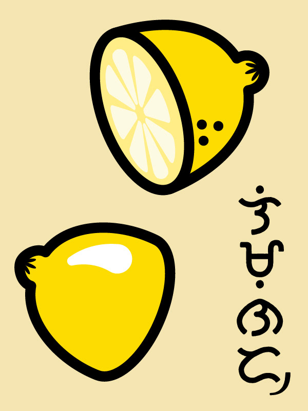
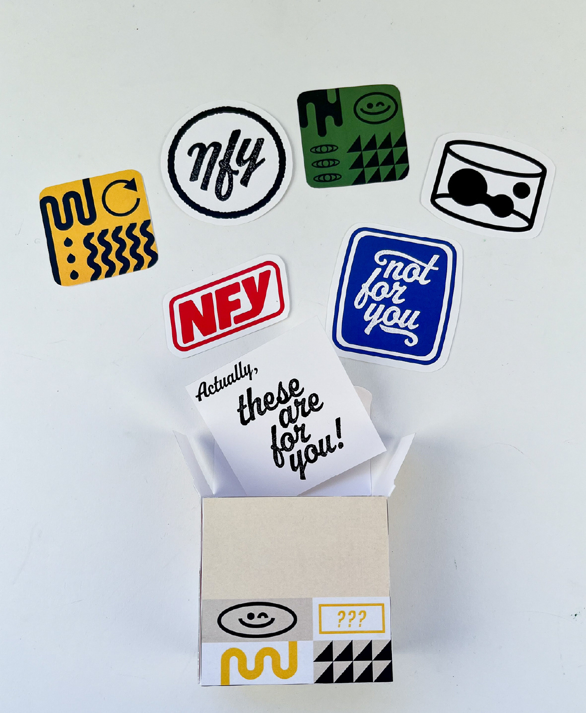
I wanted the branding to be versatile and creative without looking to cluttered, so I went with a pattern and symbol motif. These elements are brought together with a grid-like structure and bold, primary color scheme.
Unboxing Experience
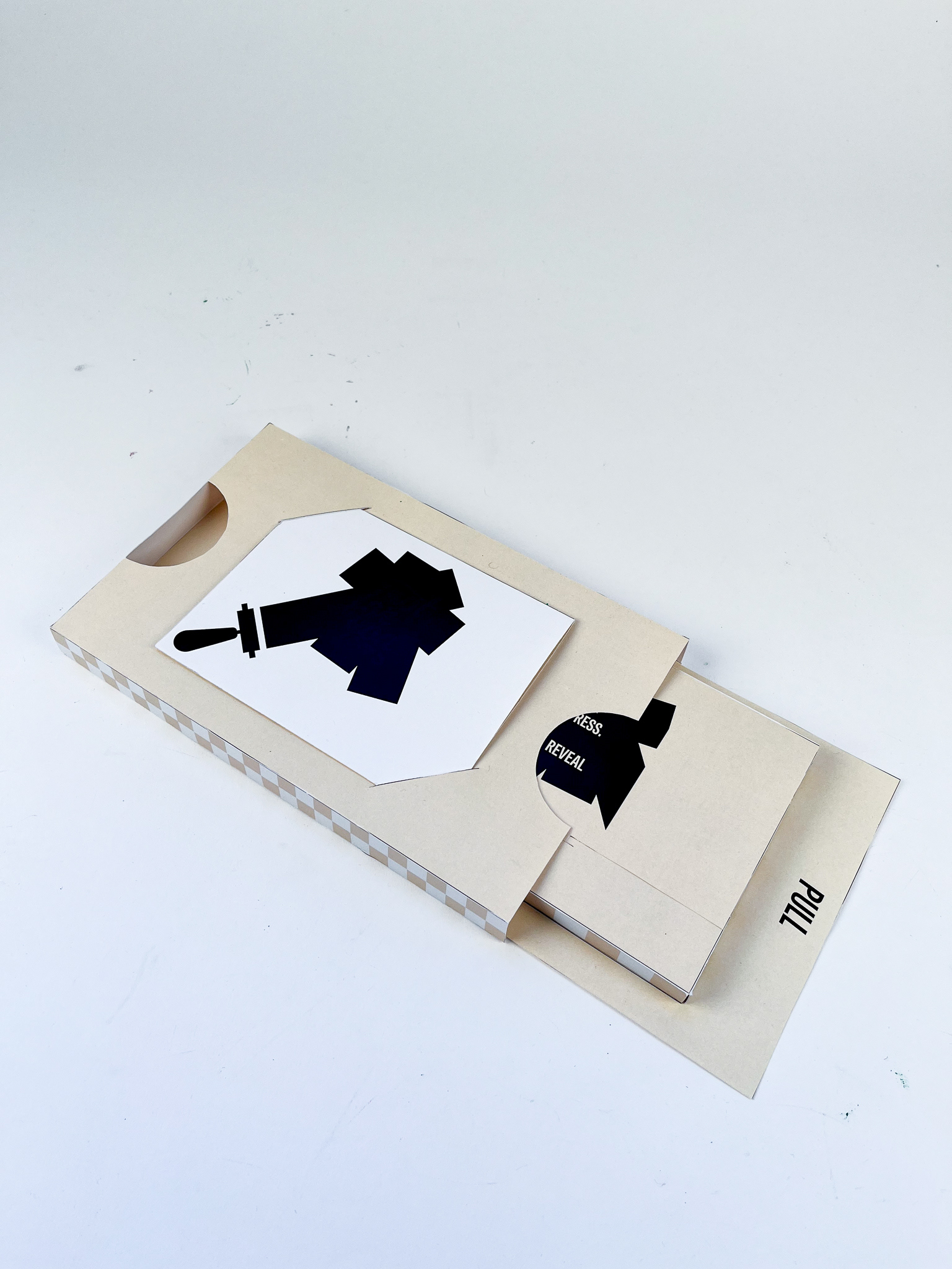
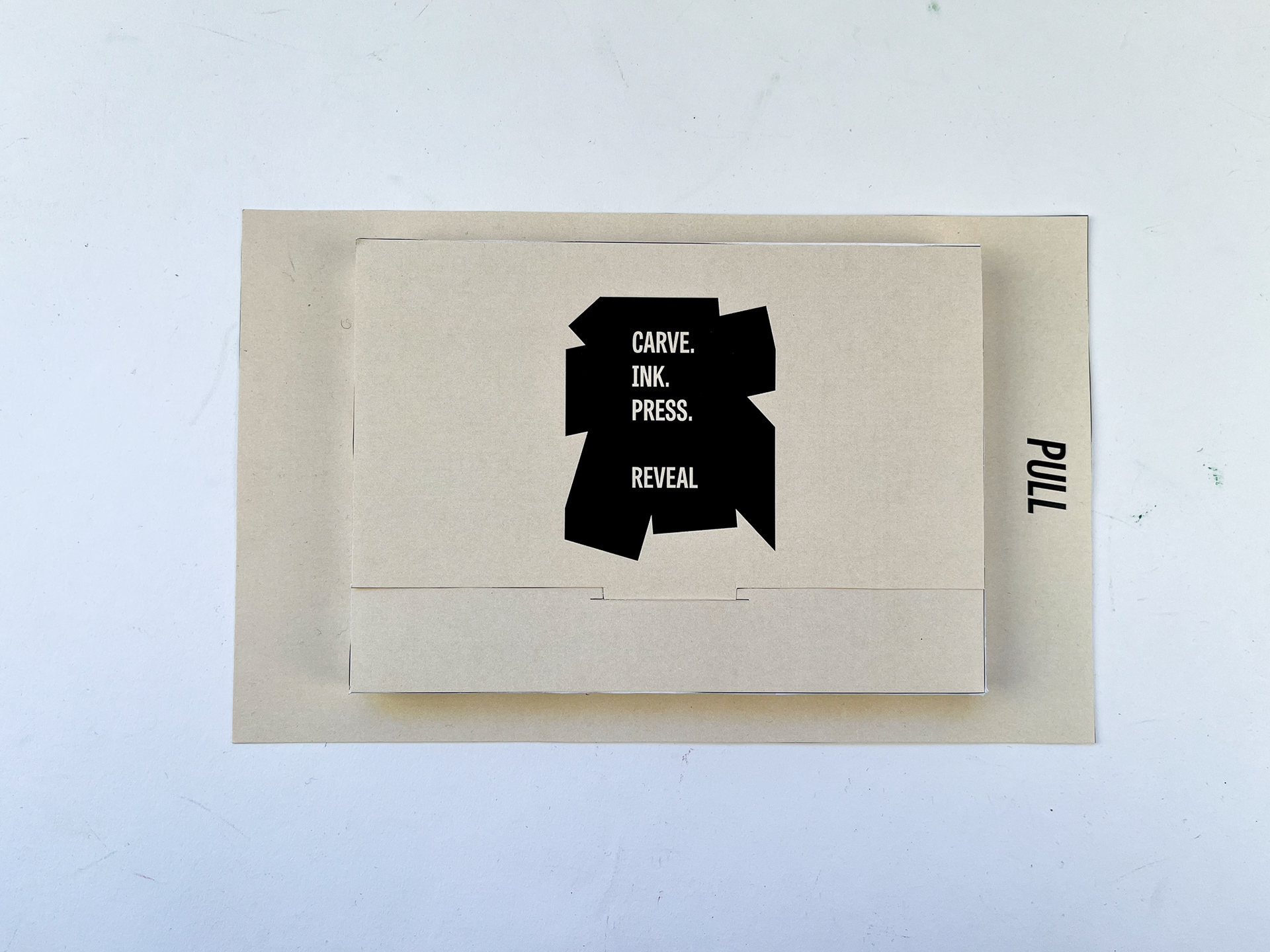
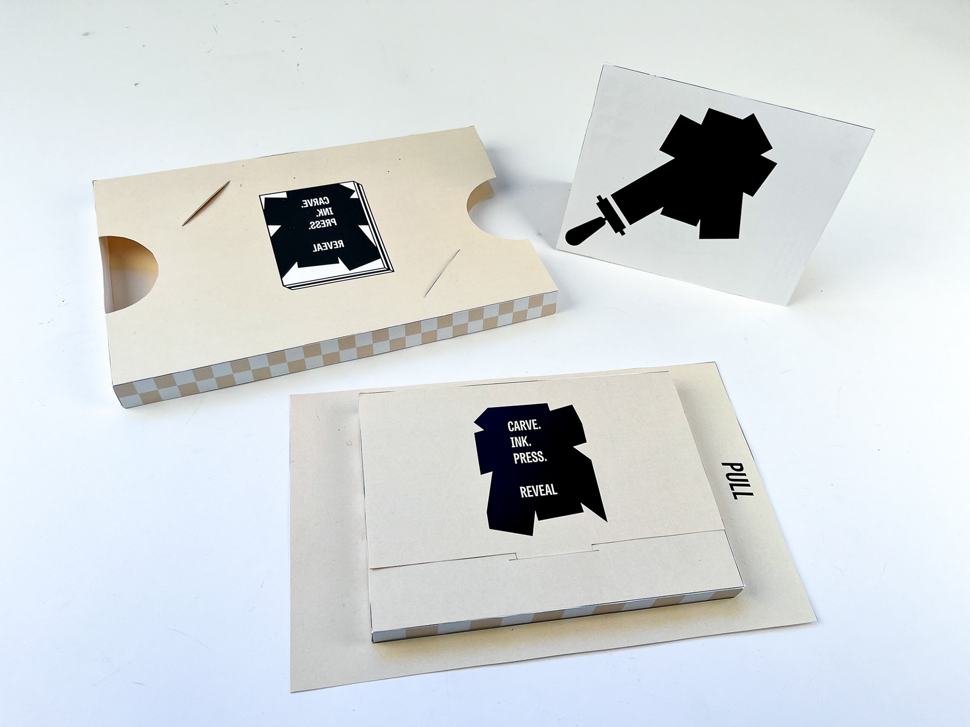
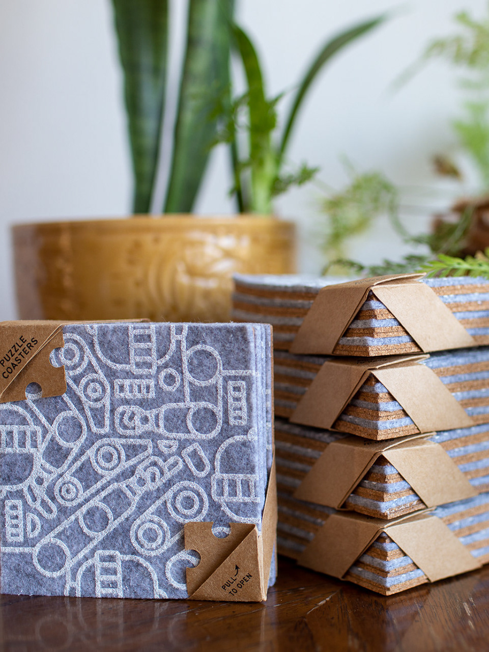
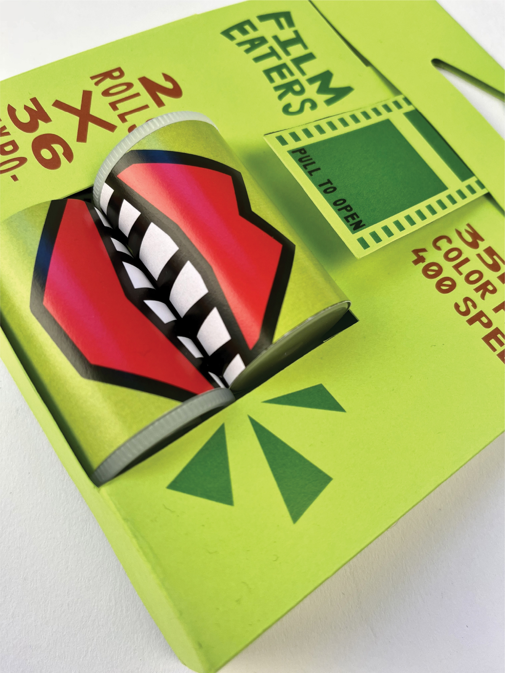
The inside of the box contains multiple products, so they were designed to be revealed in layers. Opening the box reveals just the top layer. Once that layer is removed, the bottom layer is revealed. Each layer also has a different feel.
Final Application
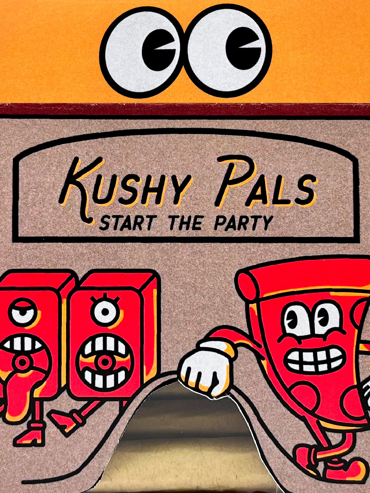
The symbols, patterns, and logos were applied on the outside of the box and throughout the unboxing experience to create a bold visual brand.
