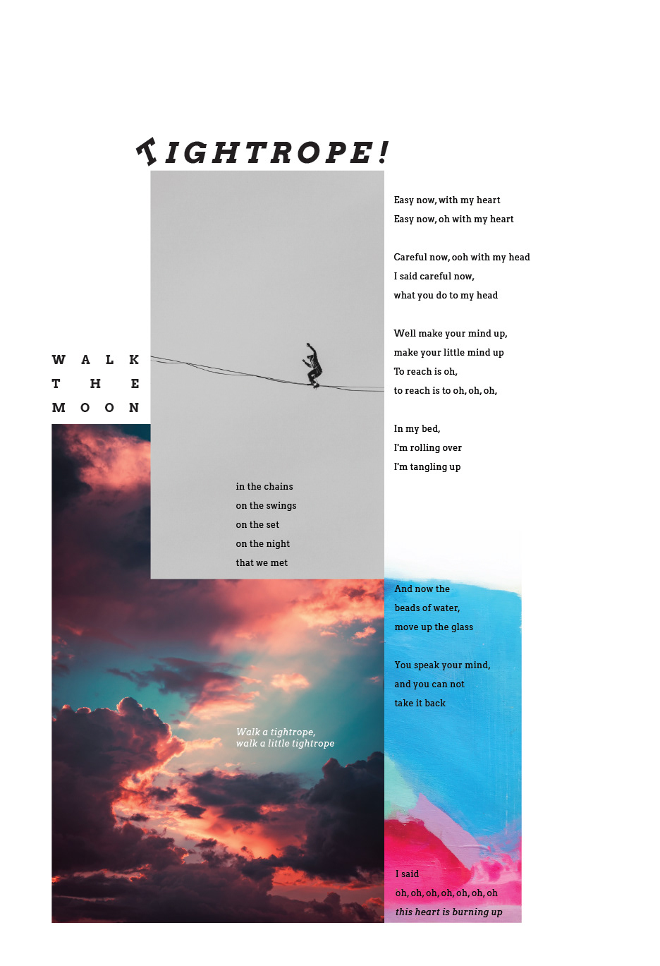
design brief
We were assigned to create two posters centered around song lyrics of our choice. The first poster required a logo-type as the focal point with interesting placement for the lyrics. The second poster was focused on the fusion of image and type.
I chose the song "Tightrope" by Walk the Moon. It's a playful and colorful indie song with high energy that amplifies as the song progresses. My first goal was to capture the mood of the song in both poster iterations. Secondly, I wanted to make sure that the posters could function individually or as a set.
Poster One Process
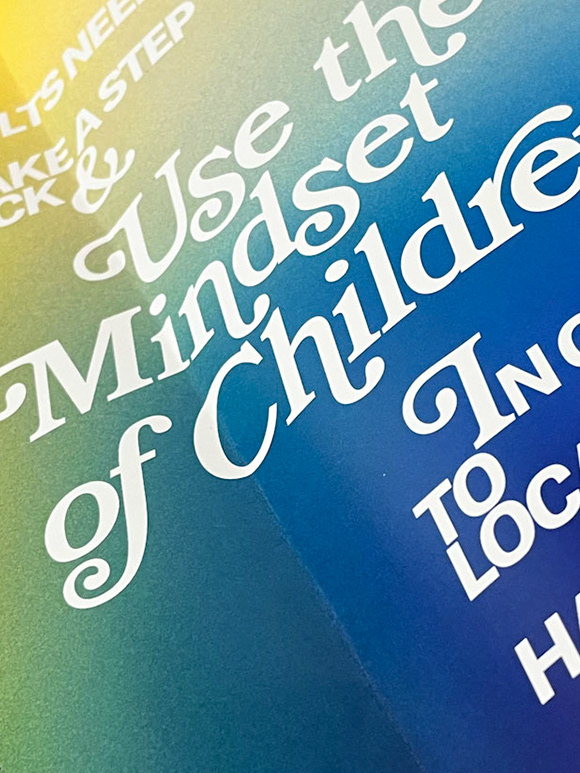
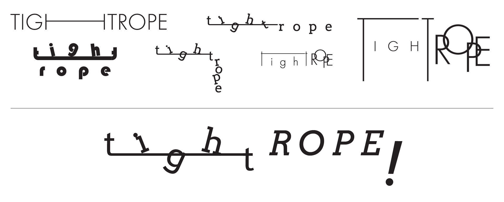
The logotype was designed first. I wanted to create a literal tightrope using it's letters.
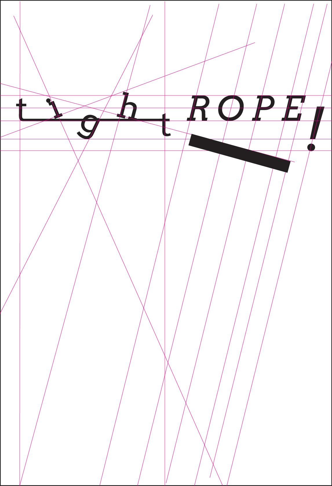
Working off the finalized logo type, a post-modern grid was applied to guide the layout of the lyrics. I wanted to keep the lyrics playful and translate some of the lyrics into typographic layout.
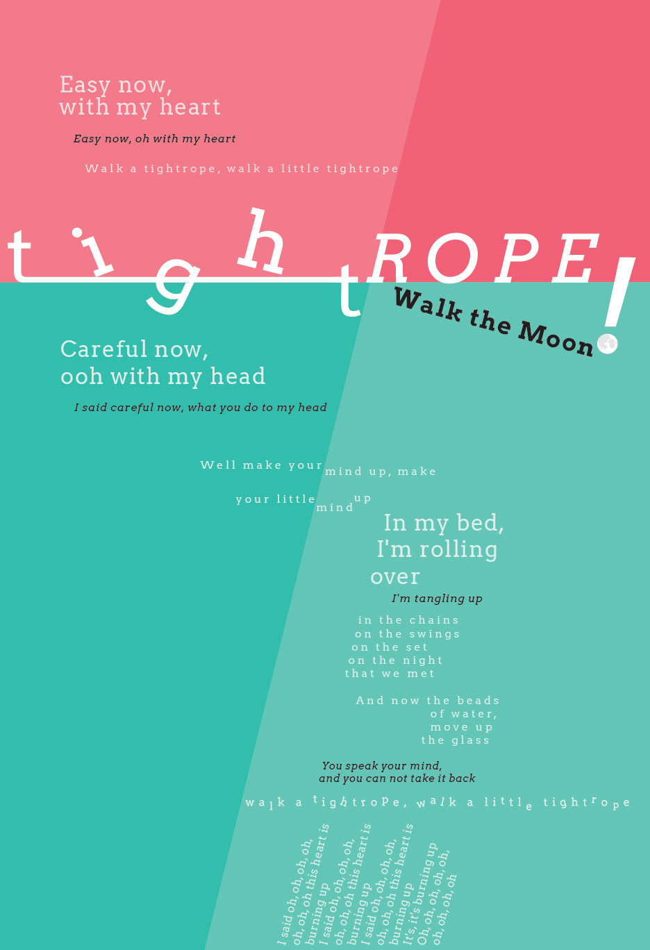
The lyric "Well make your mind up" has an indecisive layout. The baselines shift and it splits between the teal shades because it cant make up its mind.
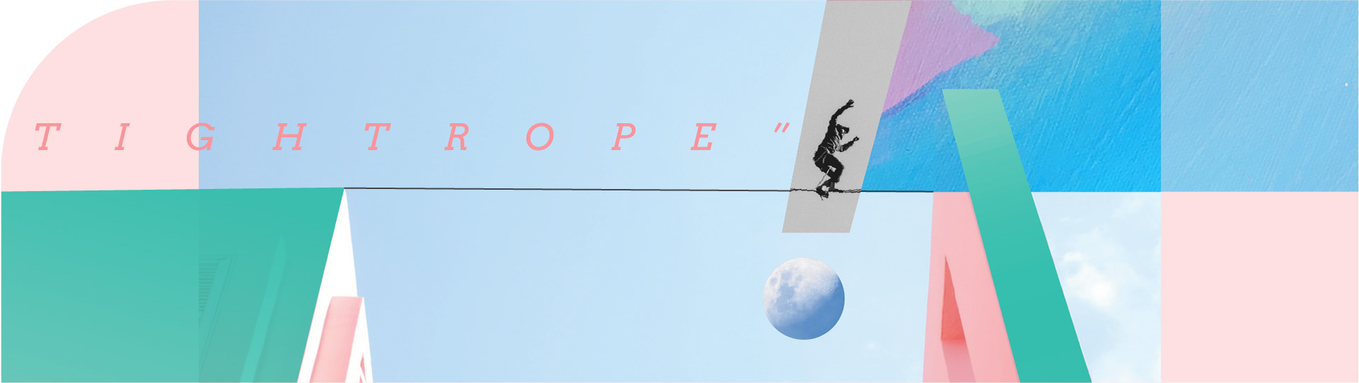
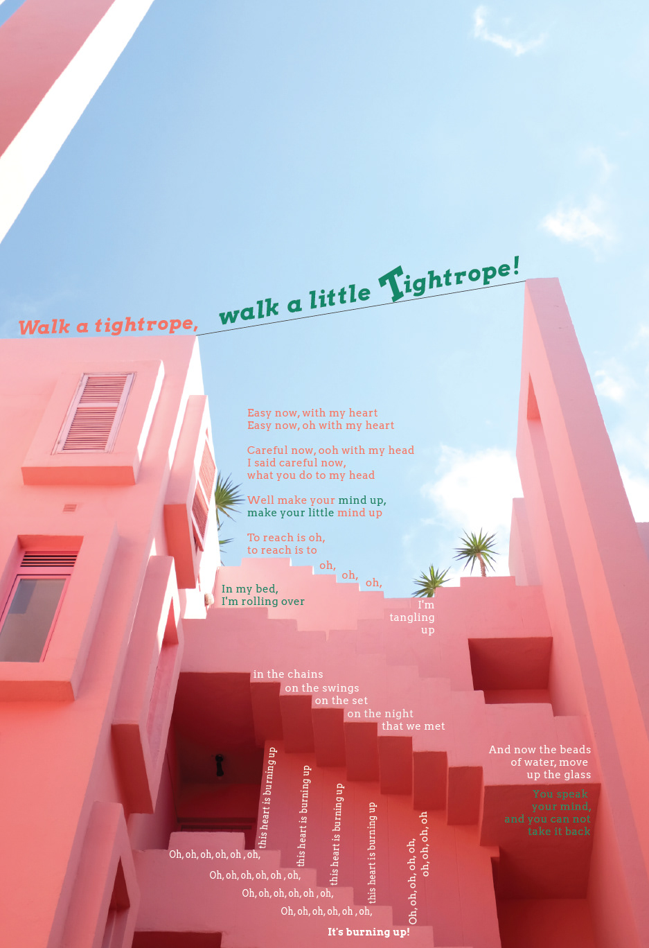
POSTER TWO PROCESS
I looked for images that matched the tone of the song, and explored layout options for the lyrics. From the explorations, I chose the most successful elements to create a collage that seamlessly integrates type, image, and graphic elements. Also, it was designed next to poster one to match some of its grid structures.
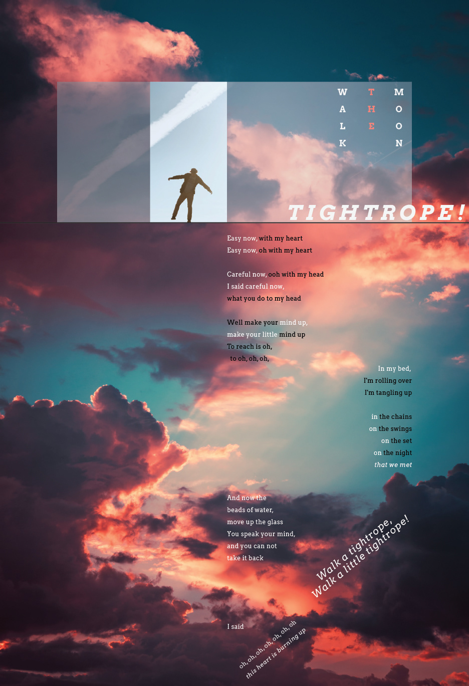
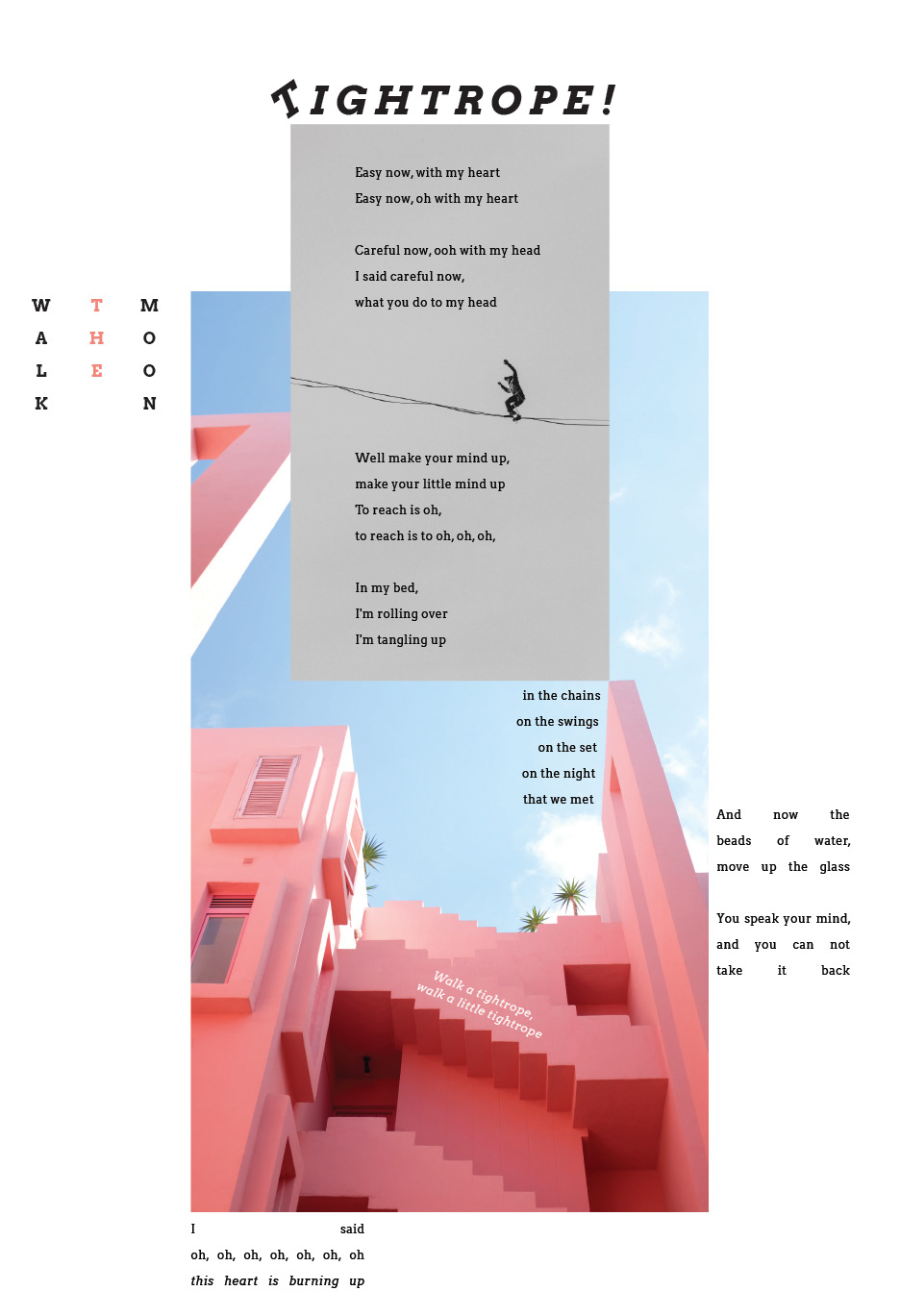
Final Application
After poster two was finalized, I went back to edit poster one in order to further emphasize the cohesion of the posters.
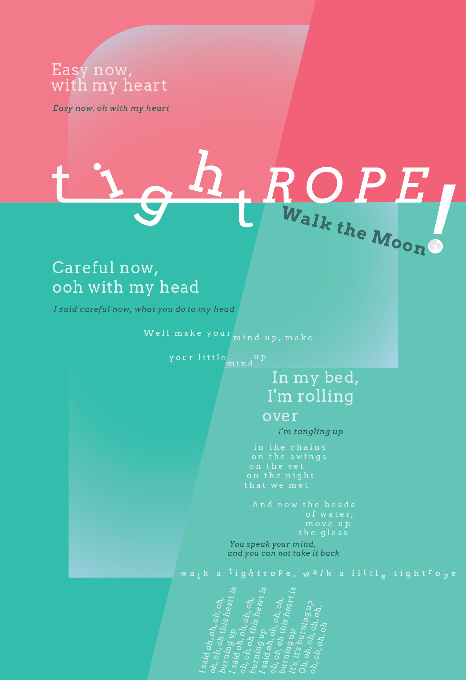
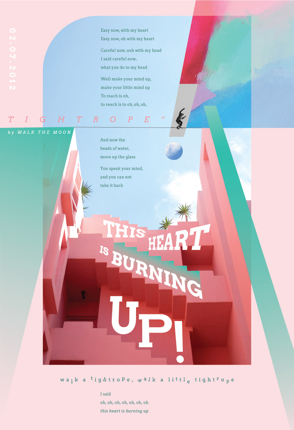

Image links
Cloudy Sky || Tightrope Walker || Colorful Painting || Balancing Figure || Pink Buildings || Moon