Design Brief
Create packaging for a cannabis company selling three different products, which individually promote a different state-of-mind. The products must have a cohesive visual language that can quickly draw in interest from the consumer while capturing the promoted state-of-mind.

Concept Sketch
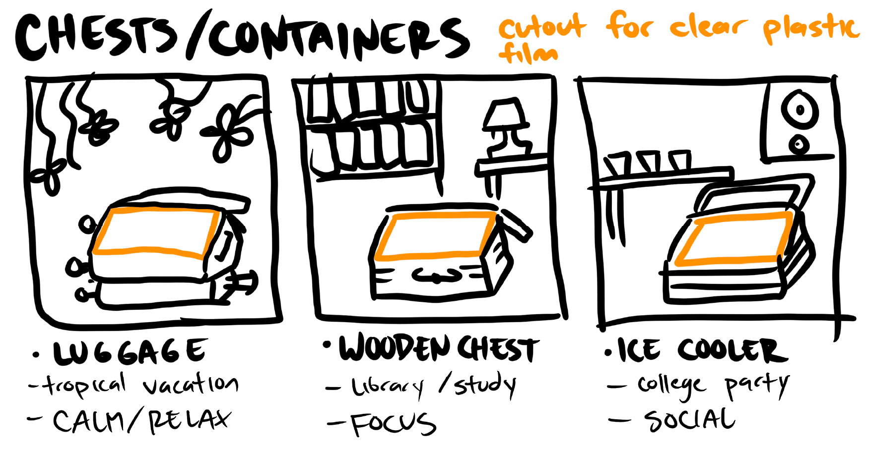
My initial idea was to draw three containers which showed the actual products inside the illustration through a window. Each container would be set in a scene that fits the state-of-mind.
Early Process
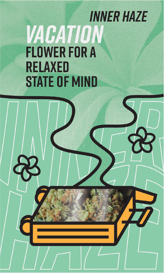
This first design was not successful because there were too many different concepts and the idea of a relaxing vacation was not fully supported by the illustrations. Subsequent designs had a more focused concept while pushing the vacation and relaxation theme.
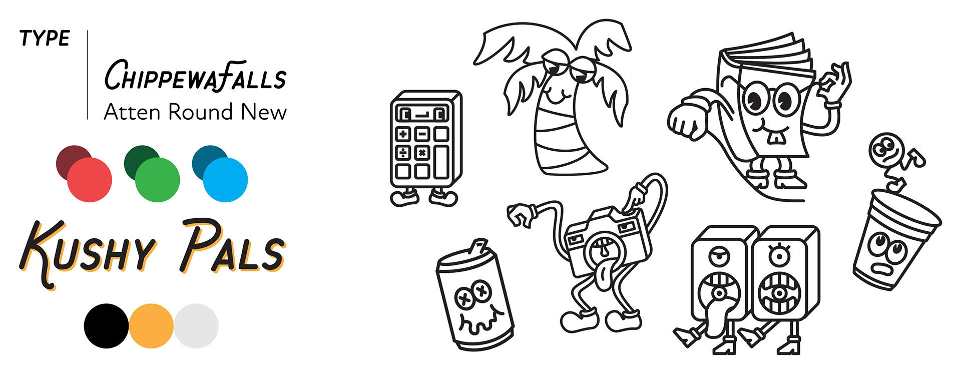
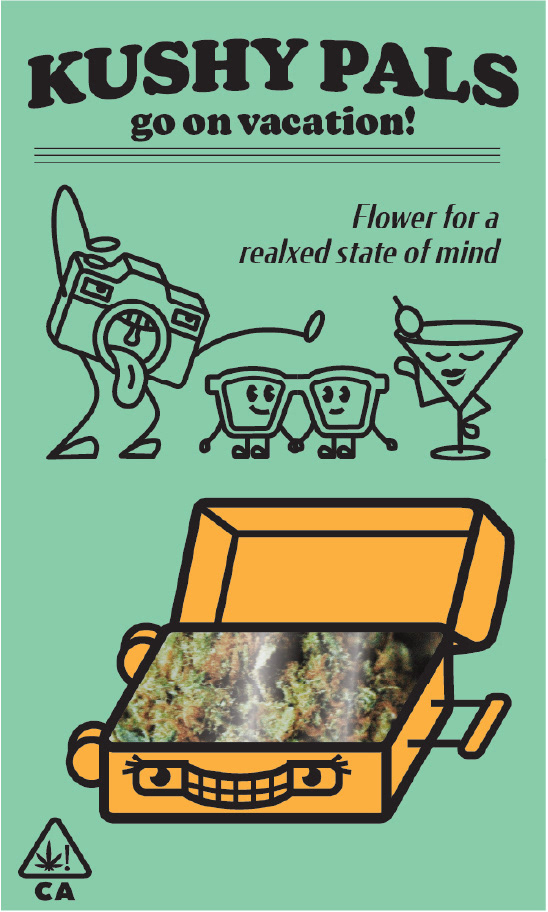
I drew inspiration from vintage cartoons and mascots to explore as a visual language. I chose colors and type that complimented the style of the illustrations.
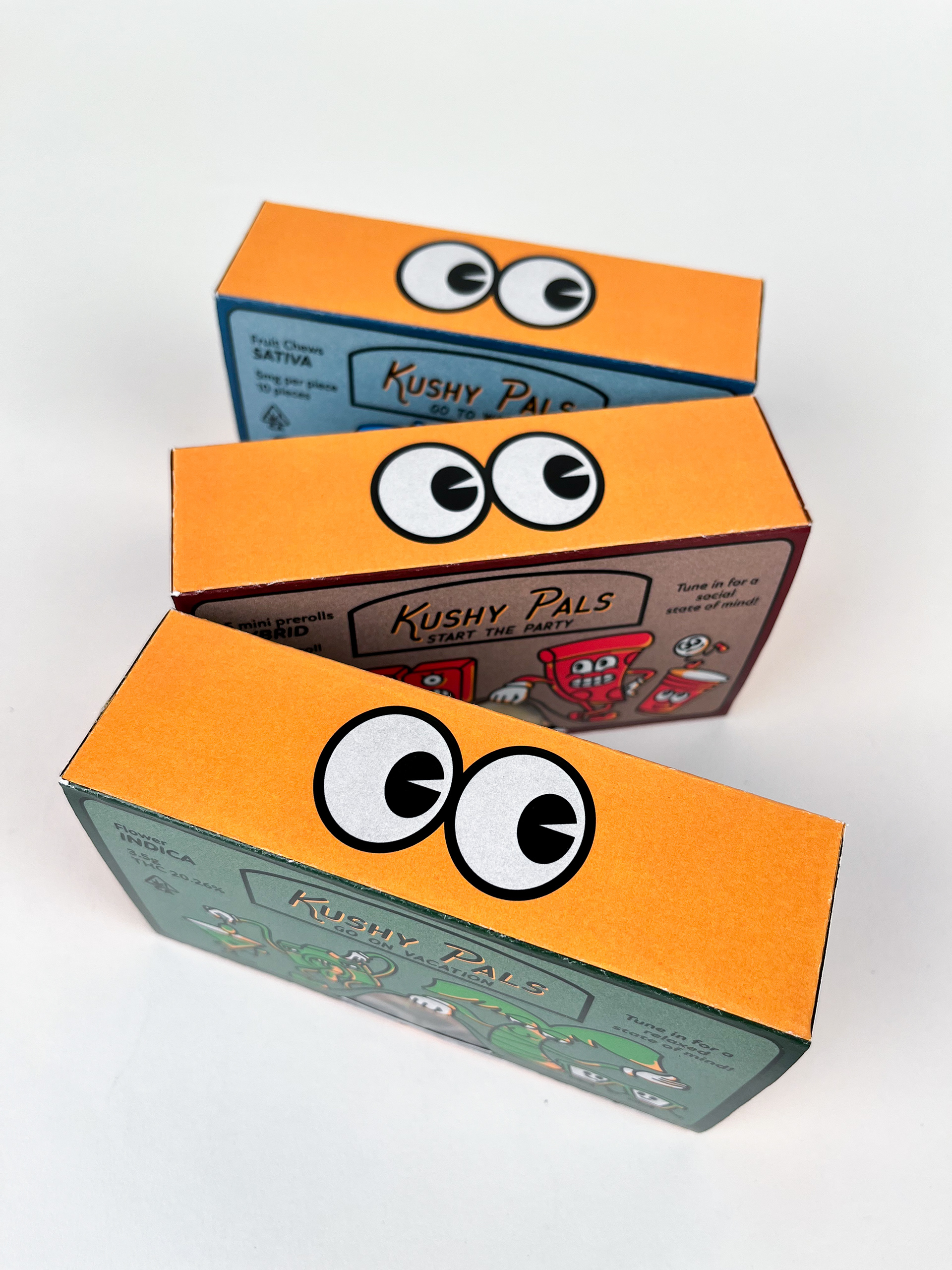
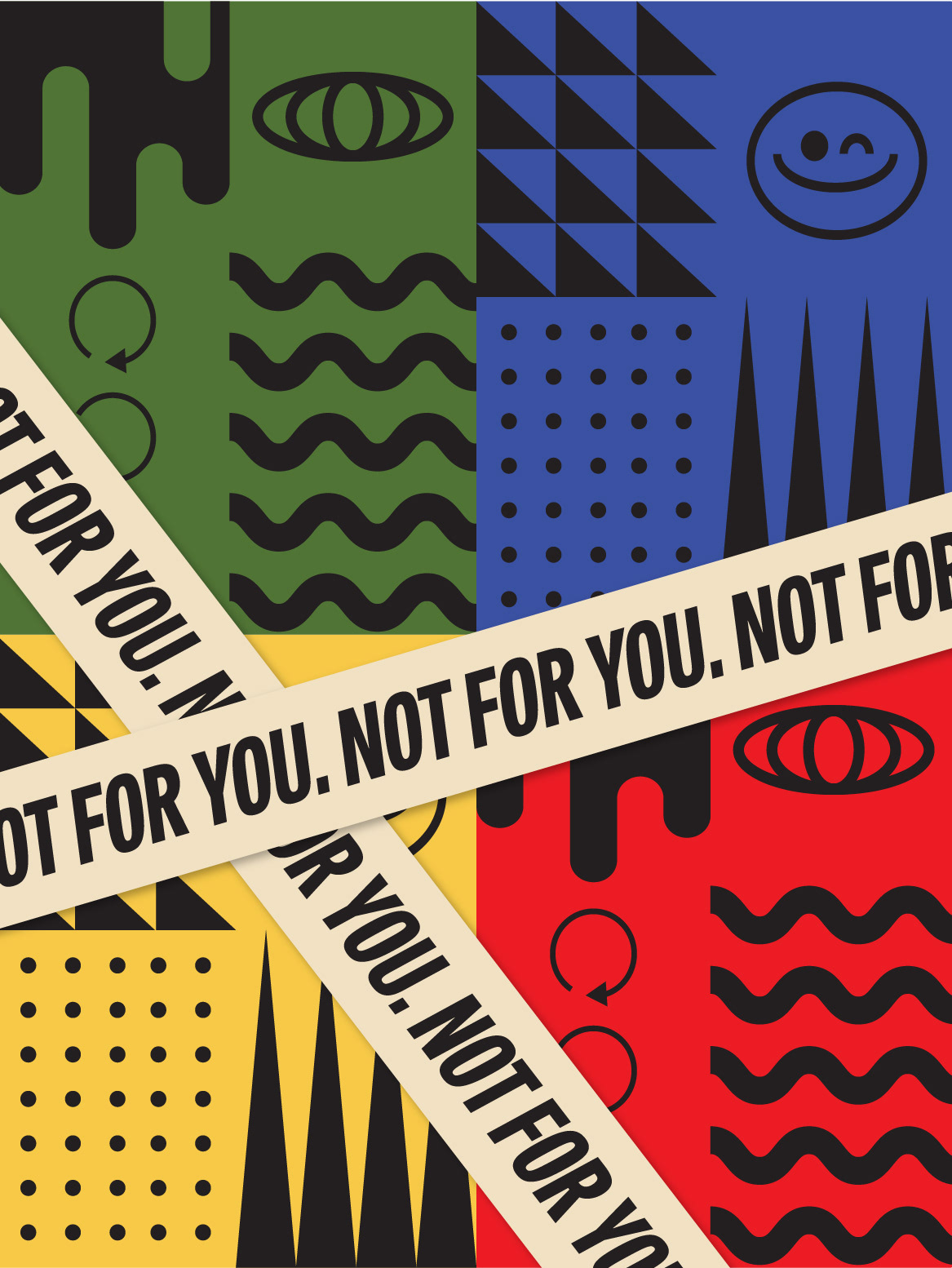
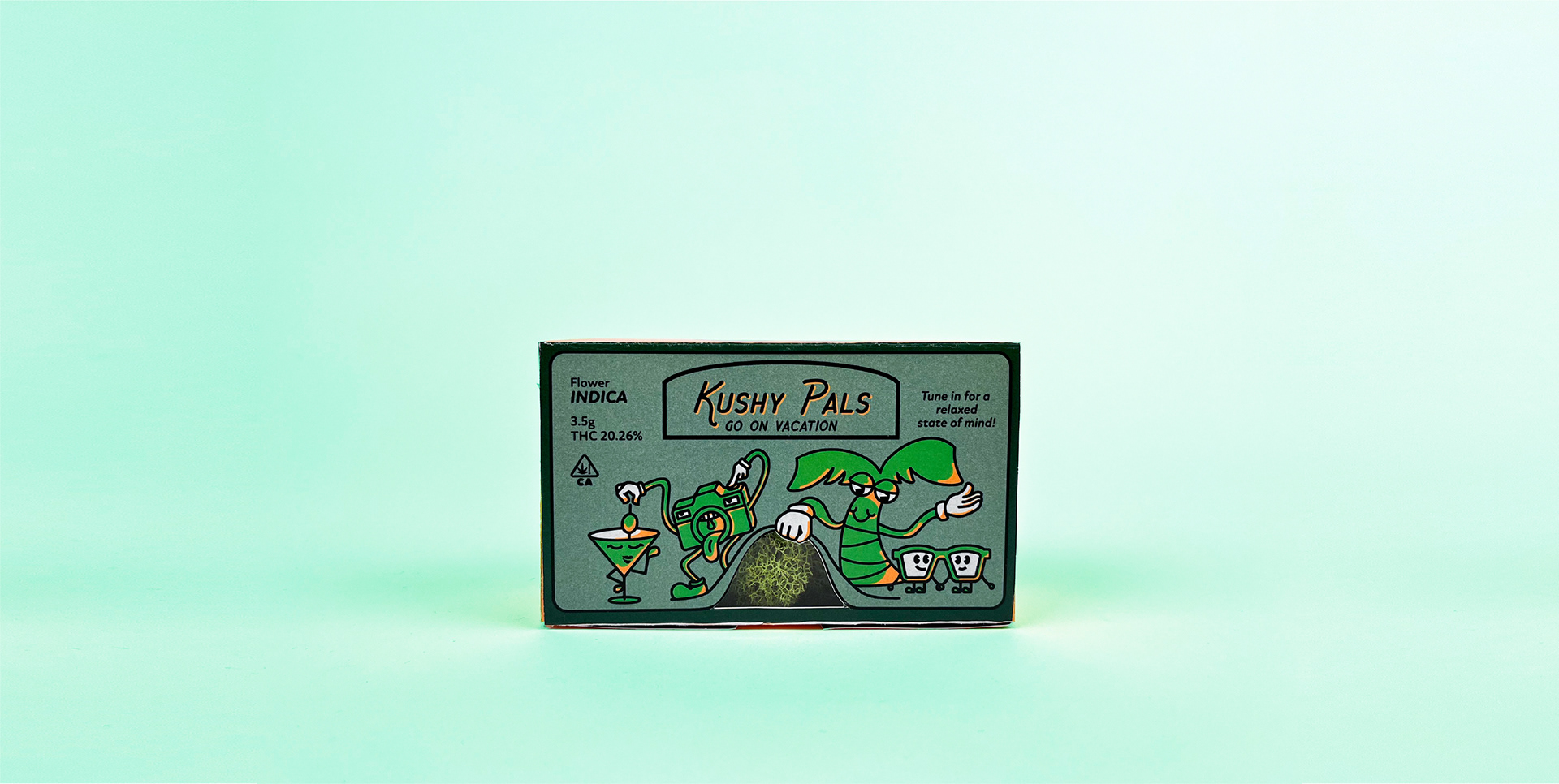
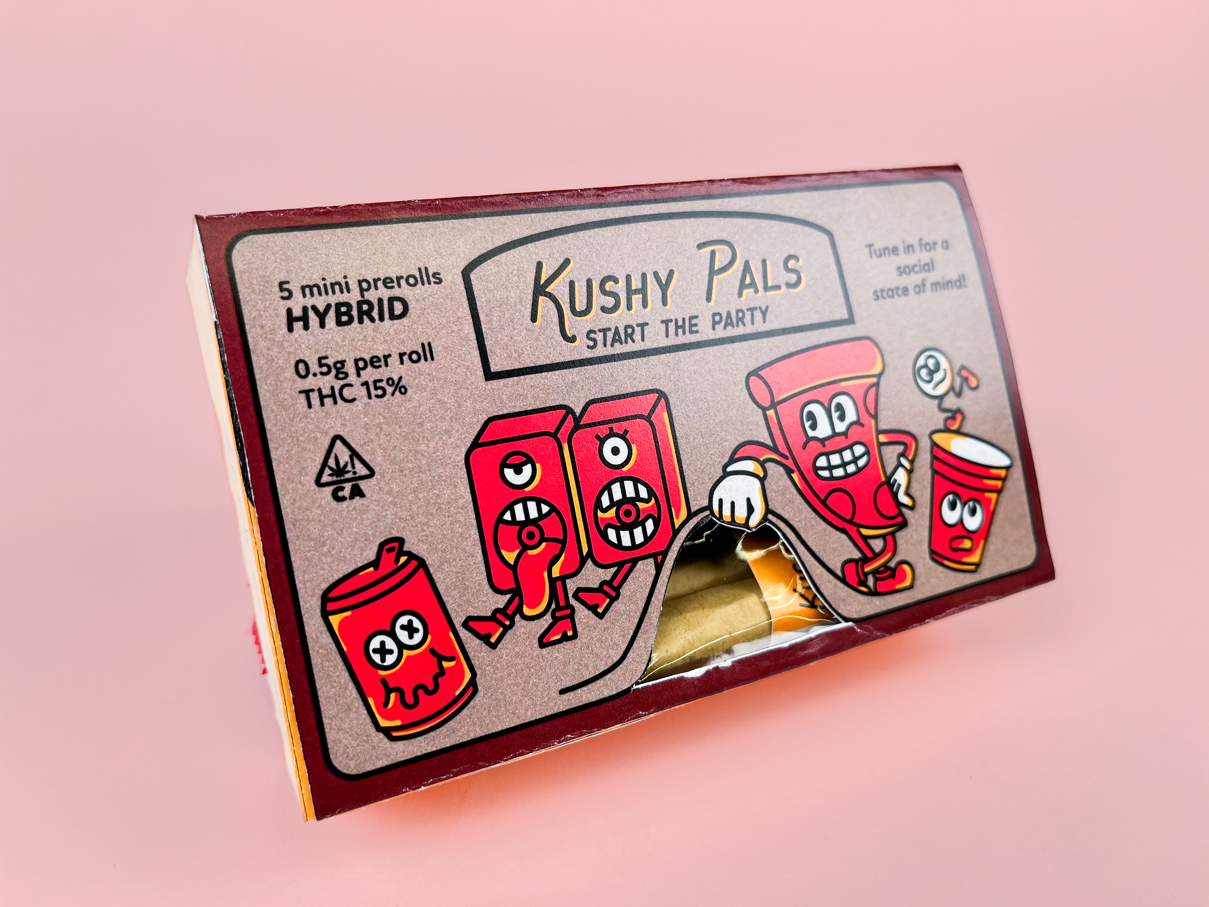
Final Product
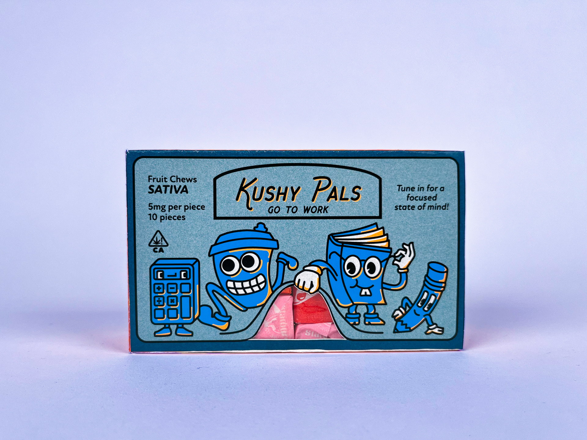
The characters represent a scene that promotes each product’s intended use. The window concept is no longer supported by the original container illustrations, but it is still integrated with the illustrations in a way that blends reality.
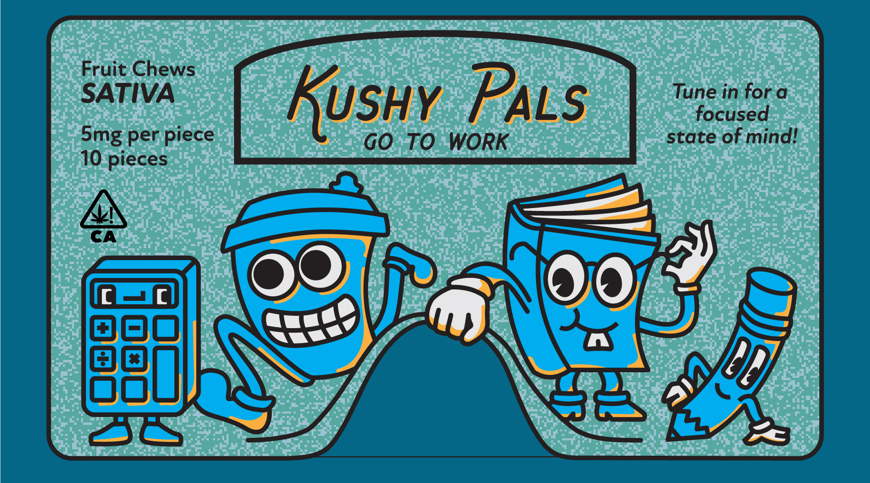
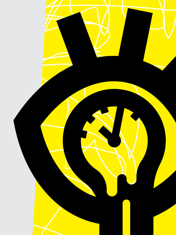
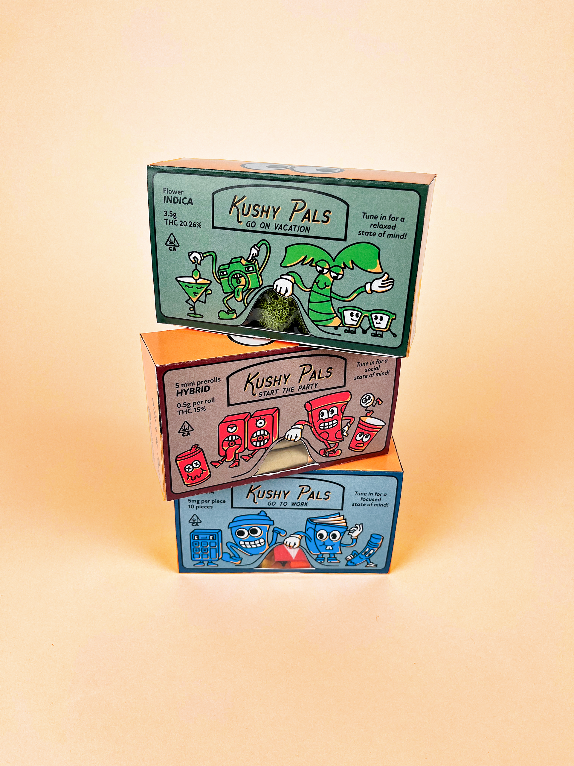
Characters related to studying to promote focus.
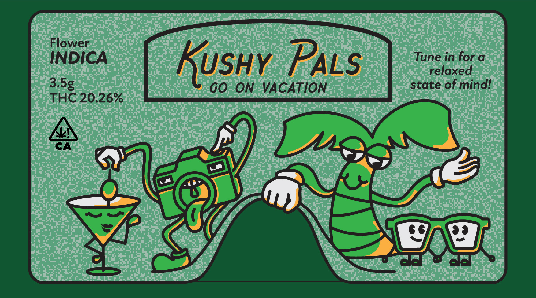
Characters related to vacation to promote relaxation.
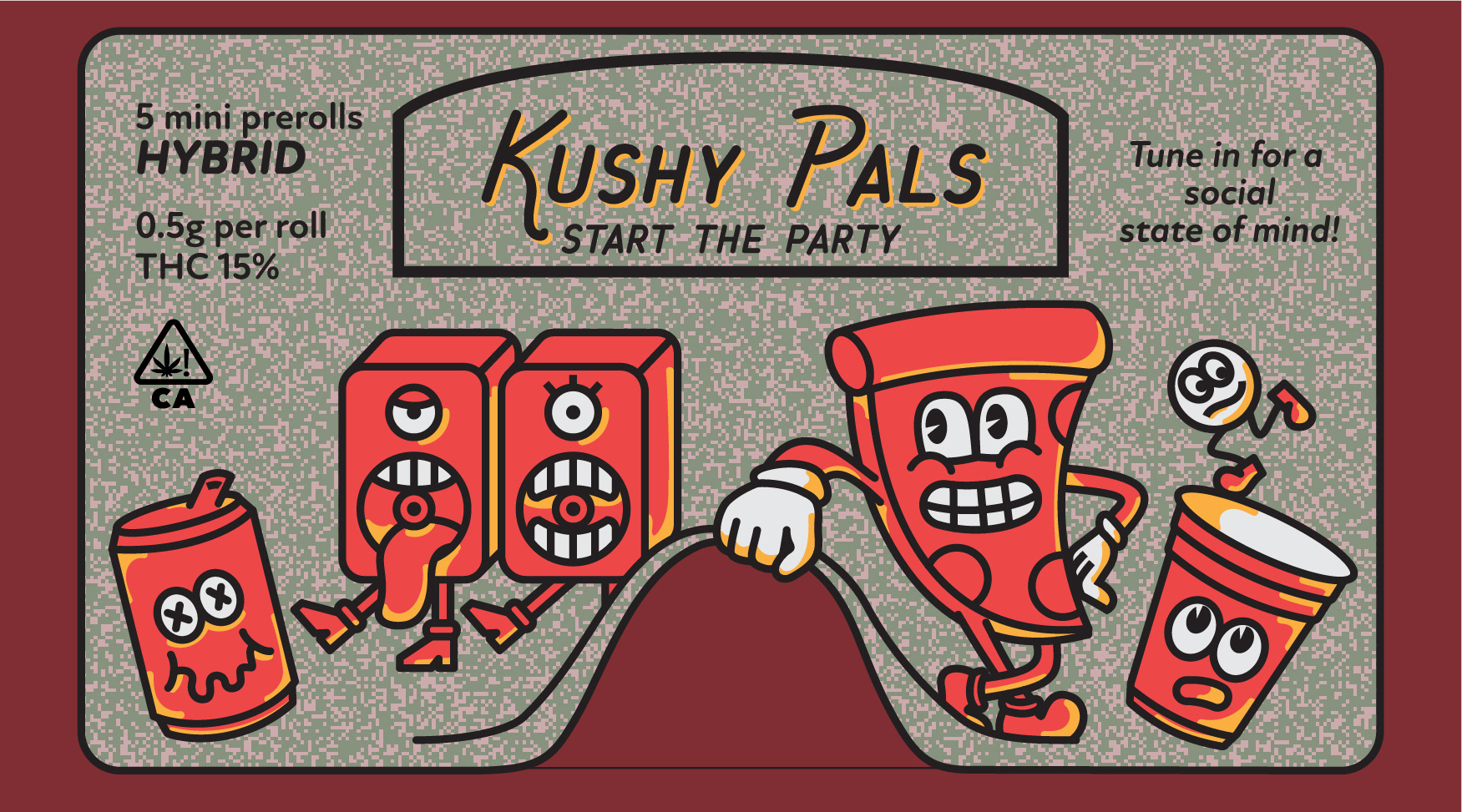
Characters related to partying to promote social interaction.
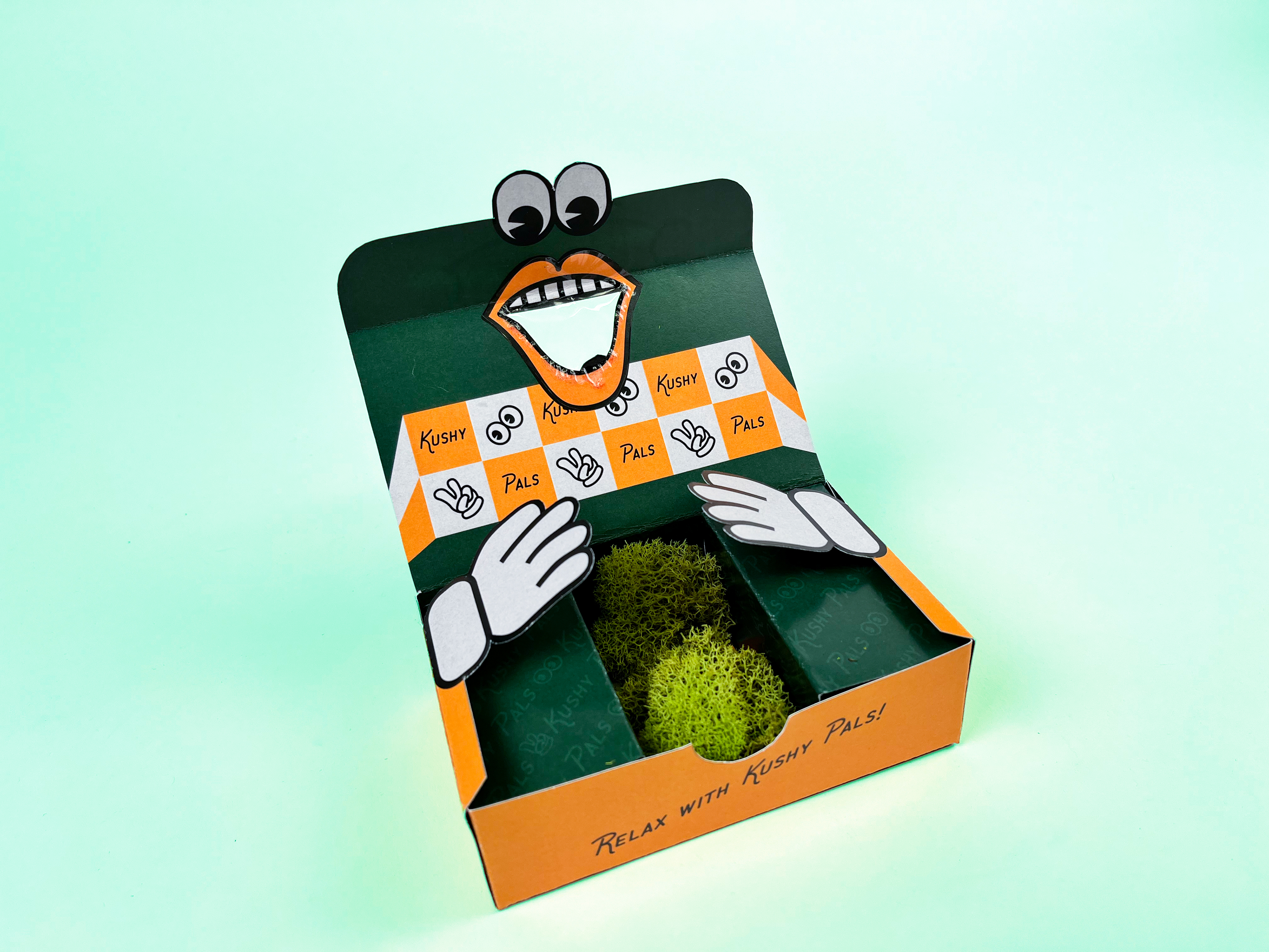
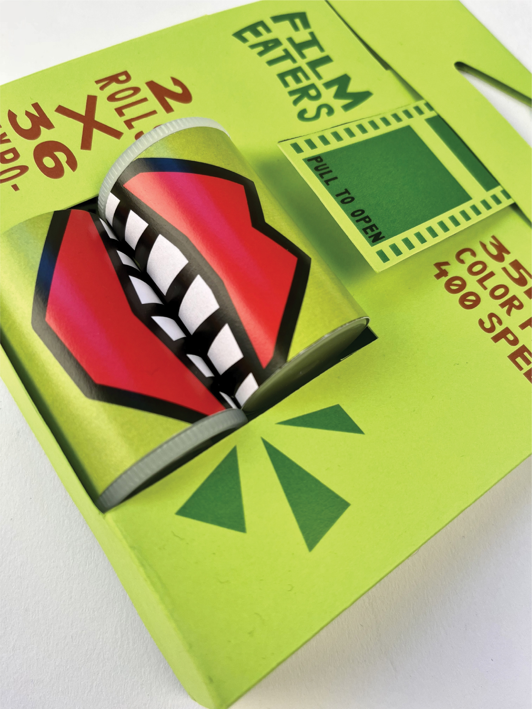
I was able to maximize the use of the window by turning it into a mouth with eyes on the inside of the packaging.
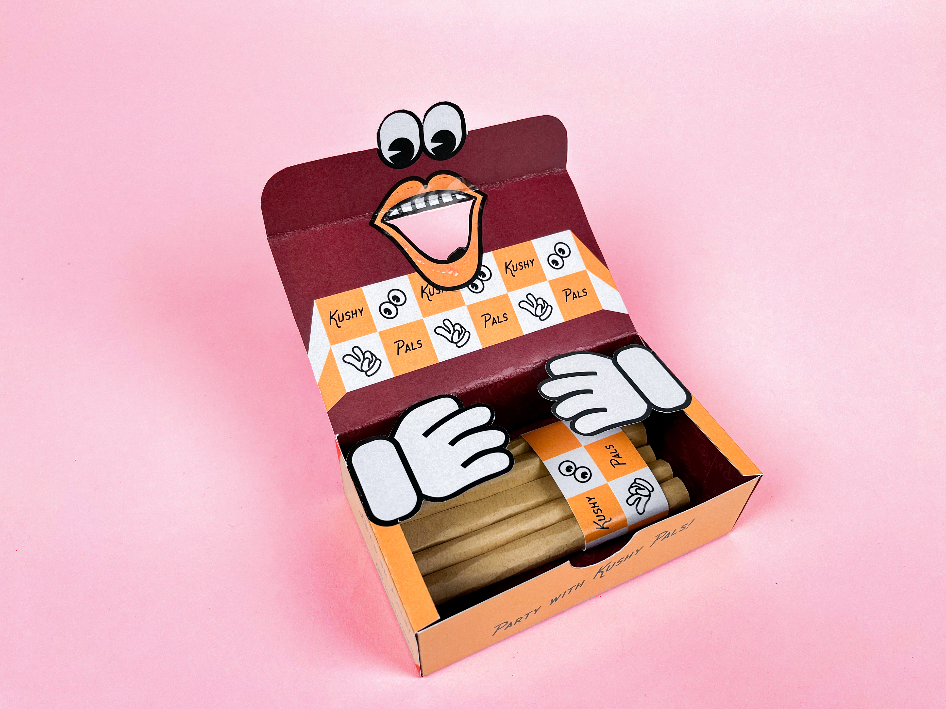
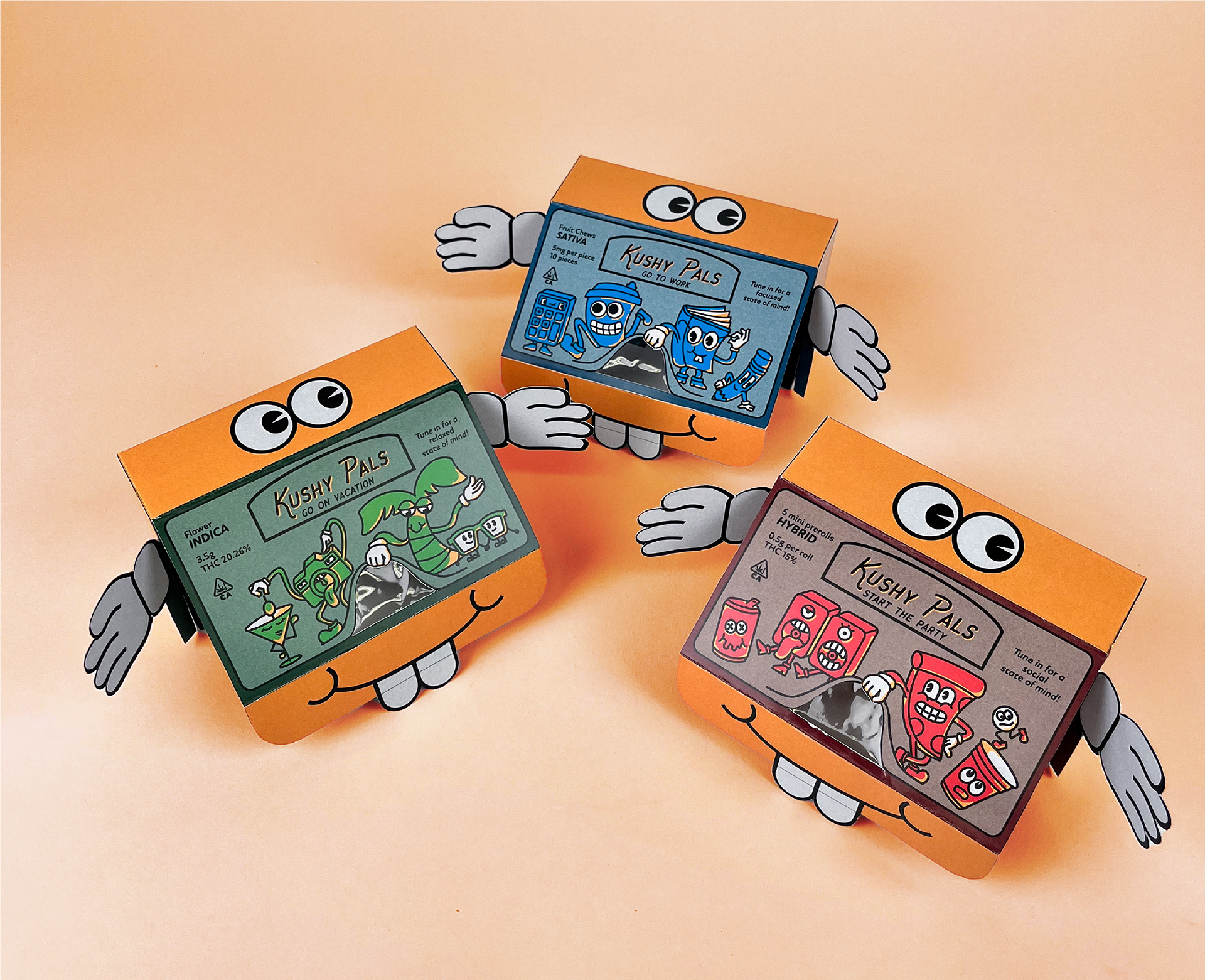
I wanted the boxes to be really interactive and reward users for being curious and exploring.